
Build the dashboard as a set of small, shared React primitives first, then compose pages from them. That keeps your SaaS admin area clean, fast to extend, and much less painful when product requests change. shadcn/ui gives you accessible building blocks, Tailwind CSS handles styling, and React ties the whole system together. Tailwind CSS is also widely used, with its GitHub project sitting above 85,000 stars [source: GitHub].
TLDR: A strong SaaS admin dashboard starts with reusable layout, table, form, card, and navigation components. For example, if a support team checks 200 customer records per day, cutting each lookup from 12 seconds to 5 seconds saves about 23 minutes daily. Use shadcn/ui for polished interface parts, Tailwind CSS for quick styling, and React components to avoid repeating the same messy code across pages.
Start with the real admin workflow
Do not begin with colors. Start with jobs people need to do. Admin dashboards usually support tasks like viewing users, checking billing, changing permissions, reviewing activity logs, and fixing account issues.
A good first version should include:
- A sidebar for main sections like Users, Billing, Reports, and Settings.
- A top bar with search, team switcher, and account menu.
- Data tables with filters, sorting, pagination, and bulk actions.
- Forms for account edits, role changes, and settings.
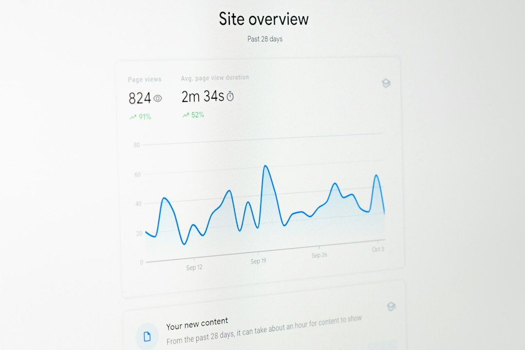
- Status cards for revenue, signups, churn, and support volume.
Honestly, it feels like half of admin UI work is rebuilding the same table, modal, and dropdown again and again. That is exactly where reusable components pay off.
Set up the stack
A common setup is Next.js, React, Tailwind CSS, and shadcn/ui. Next.js gives you routing and server rendering. Tailwind makes spacing and layout easy. shadcn/ui gives you copyable components built on Radix UI and styled with Tailwind.
The key thing about shadcn/ui is that it is not a locked component library. You copy the component code into your project. That means you can edit it freely. No fighting hidden styles. No waiting for a package update because one button needs a different height.
You might install pieces like this:
npx shadcn@latest init
npx shadcn@latest add button card table dialog dropdown-menu input form
Then create a simple folder structure:
components/uifor shadcn/ui base components.components/layoutfor sidebar, header, shell, and page wrappers.components/datafor tables, filters, empty states, and badges.features/users,features/billing, andfeatures/reportsfor business screens.
Build a reusable app shell
Your app shell is the frame around every admin page. It should include the sidebar, header, content width, page title area, and mobile behavior.
Keep it boring. Boring is good here. A predictable shell helps users move faster. Put the same actions in the same places. Search should not jump around. Filters should not look different on every page.
A simple page pattern may look like this:
<AppShell>
  <PageHeader
    title="Users"
    description="Manage accounts, roles, and access."
    action=<Button>Invite user</Button>
  />

  <UserTable />
</AppShell>
This structure makes each page easy to scan. It also gives designers and developers a shared pattern. That saves time when the product grows.
Use cards for metrics, not decoration
Cards are useful when they show clear numbers. Keep them focused. One card, one idea.
- Monthly recurring revenue: $48,200
- Trial conversion: 18.4%
- Active teams: 1,284
- Open support issues: 37
Add small trend text under each number. Use green for healthy movement and red for warnings, but do not rely on color alone. Add labels like up 6% or down 3%. Accessibility matters, especially in tools people use all day.
Make tables feel fast
Admin dashboards live or die by tables. A bad table makes simple work feel slow. It drives me crazy when changing a filter takes three seconds and the whole page flashes white.
Use loading skeletons instead of empty blanks. Keep filters visible. Save table state in the URL when possible, so users can share the exact view. Add bulk actions for common tasks like disabling users, exporting rows, or changing plans.
For larger data sets, add server-side pagination and search. Do not load 20,000 rows into the browser and hope for the best. The interface may work on your laptop, then crawl on a support rep’s older machine.
Create form components once
Forms are another place where reuse matters. Build standard fields for text inputs, selects, switches, date pickers, and error messages. Pair shadcn/ui form components with a form library like React Hook Form if your forms need validation and controlled state.
Use short labels. Show help text only where needed. Put destructive actions, like deleting a workspace, behind a dialog. The button should say what will happen, not just Confirm.

Polish the small states
Empty states, error states, and loading states are not extras. They are part of the product. A new SaaS account may have no users, no invoices, or no reports yet. Tell the user what to do next.
A useful empty state includes:
- A short title.
- One sentence of context.
- One clear action button.
For example: No team members yet. Invite your first teammate to share access. Then show an Invite user button.
Keep the design system small
You do not need 12 button styles. Start with primary, secondary, ghost, and destructive. Use consistent spacing. Pick a simple type scale. Define status colors for success, warning, danger, and neutral.
The best SaaS dashboards feel calm. They help users act without thinking too much. With shadcn/ui, Tailwind CSS, and reusable React components, you can build that kind of admin interface without turning your codebase into a junk drawer.