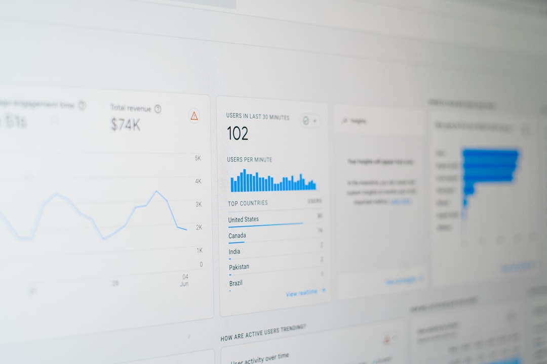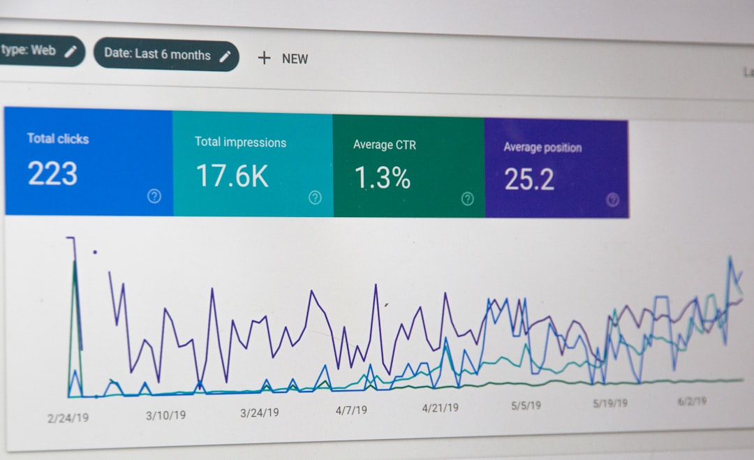
SEO reporting is most useful when it turns scattered data into a clear story: what changed, why it changed, and what should happen next. Google Data Studio, now known as Looker Studio, is one of the most practical tools for building SEO dashboards because it connects to key marketing data sources, visualizes performance trends, and makes reports easy to share with clients, managers, or internal teams.
TLDR: Google Data Studio helps you create interactive SEO dashboards using data from Google Search Console, Google Analytics, Google Ads, spreadsheets, and third-party connectors. The best dashboards focus on meaningful SEO metrics such as organic traffic, rankings, clicks, impressions, conversions, and technical health. Start with clear goals, connect the right data sources, design clean visualizations, and use filters to make the report easy to explore. A good SEO dashboard should not just show numbers; it should help people make better decisions.
Why Use Google Data Studio for SEO Reporting?
Traditional SEO reports often come in the form of static spreadsheets or long PDF documents. While those can be useful, they quickly become outdated and can be difficult to interpret. Google Data Studio solves this by creating live, interactive dashboards that update automatically when connected data sources refresh.
For SEO teams, this is especially valuable because search performance changes constantly. A dashboard can help you monitor keyword visibility, organic sessions, landing page performance, conversions, and content growth without manually rebuilding reports every week or month.
The biggest advantages include:
- Automated reporting: Reduce repetitive manual work by connecting live data sources.
- Custom visualization: Use charts, tables, scorecards, filters, and date comparisons.
- Centralized SEO data: Combine Search Console, Analytics, spreadsheets, and other platforms in one place.
- Easy sharing: Send a link to stakeholders instead of exporting endless files.
- Better storytelling: Turn raw data into insights that explain progress and priorities.

Step 1: Define the Purpose of Your SEO Dashboard
Before connecting data or choosing charts, decide what the dashboard is supposed to accomplish. A report for an executive team will look very different from a dashboard used by SEO specialists. Executives usually want high-level performance, revenue impact, and trends. SEO managers may need deeper details, such as page-level data, query performance, crawl issues, and content opportunities.
Start by asking:
- Who will use this dashboard?
- What questions should it answer?
- Which SEO goals are most important?
- How often will the report be reviewed?
- What actions should someone take after viewing it?
For example, if your goal is to track organic growth, your dashboard may focus on clicks, impressions, organic sessions, ranking movement, and conversions. If your goal is content optimization, you may emphasize landing pages, query data, engagement metrics, and underperforming articles.
Step 2: Connect Your SEO Data Sources
Google Data Studio works best when it pulls data from reliable sources. For SEO reporting, the two most common sources are Google Search Console and Google Analytics. Search Console shows how your site performs in Google Search, while Analytics shows what users do after they arrive on your website.
Useful SEO data sources include:
- Google Search Console: Clicks, impressions, average position, click-through rate, pages, countries, devices, and search queries.
- Google Analytics 4: Organic sessions, users, engagement, conversions, revenue, landing pages, and traffic channels.
- Google Sheets: Keyword maps, content calendars, backlink exports, manual annotations, or custom SEO scoring.
- Third-party SEO tools: Ranking data, backlink metrics, site audits, and competitive insights through connectors.
To connect a source, open Google Data Studio, create a new report, and click Add data. Choose the connector you need, authorize access, and select the correct property, account, or spreadsheet. Once connected, you can start adding charts and controls.
Step 3: Choose the Right SEO Metrics
A common mistake in SEO reporting is including too many metrics. A dashboard packed with numbers may look impressive, but it can confuse readers. The best dashboards focus on metrics that connect directly to business and SEO goals.
Some essential SEO metrics to include are:
- Organic traffic: Shows how many visitors come from unpaid search results.
- Search clicks: Measures how often users click your site in Google Search.
- Impressions: Indicates how often your pages appear in search results.
- Click-through rate: Helps evaluate title tags, meta descriptions, and search intent alignment.
- Average position: Gives a general view of ranking visibility.
- Organic conversions: Shows whether SEO traffic is producing leads, sales, signups, or other goals.
- Top landing pages: Identifies which pages drive the most organic performance.
- Top queries: Reveals keyword demand and opportunities for optimization.
Remember that some metrics need context. For instance, a drop in average position may not be a problem if clicks and conversions are increasing. Likewise, impressions can rise sharply when new content starts ranking for broader queries, even if click-through rate declines.
Step 4: Build a Clear Dashboard Layout
A strong SEO dashboard should be easy to scan. Place the most important information at the top, then move into deeper analysis below. Think of the dashboard as a story: first show the summary, then explain the details.
A practical structure might look like this:
- Overview section: Organic sessions, clicks, impressions, conversions, and revenue.
- Trend section: Line charts showing performance over time.
- Search Console section: Queries, pages, devices, countries, and click-through rate.
- Landing page section: Organic traffic, engagement, and conversion performance by URL.
- Opportunity section: Pages with high impressions but low click-through rate, or keywords ranking near page one.
Use scorecards for headline numbers, line charts for trends, tables for detailed page or query analysis, and bar charts for comparisons. Add date controls so users can change the reporting period, and include filters for device, country, page type, or traffic channel.

Step 5: Make Reports Interactive
One of the biggest benefits of Google Data Studio is interactivity. Instead of creating separate reports for every audience, you can add controls that let users explore the data themselves.
Helpful interactive features include:
- Date range controls: Let users compare this month, last month, quarter, or year.
- Dropdown filters: Segment by device, country, landing page, or content category.
- Clickable charts: Allow users to click a chart element and filter the rest of the dashboard.
- Comparison periods: Show percentage changes versus the previous period or previous year.
Interactivity makes the dashboard more useful because different stakeholders can answer their own questions. A content manager can filter by blog pages, while an ecommerce manager can focus on product pages and revenue.
Step 6: Add SEO Insights, Not Just Data
Data alone does not make a report valuable. The real value comes from interpretation. Add short notes, labels, or commentary boxes to explain important changes. For example, if organic traffic increased after publishing a new content cluster, mention it. If clicks dropped because of seasonality or a technical issue, call that out clearly.
You can also use Google Sheets to maintain a simple annotation log and connect it to your dashboard. This allows you to mark algorithm updates, site migrations, content launches, technical fixes, or major campaign changes. These notes help viewers understand why performance moved in a certain direction.
Step 7: Monitor Opportunities and Problems
An effective SEO dashboard should highlight where action is needed. For example, create a table of pages with high impressions but low click-through rate. These pages may benefit from better title tags, meta descriptions, or richer content alignment. Another useful table is keywords with an average position between 8 and 20, because small improvements may push them onto the first page or higher.
You can also track declining pages by comparing clicks over time. If an important page is losing traffic, investigate whether rankings dropped, search demand changed, competitors improved their content, or the page has technical issues.
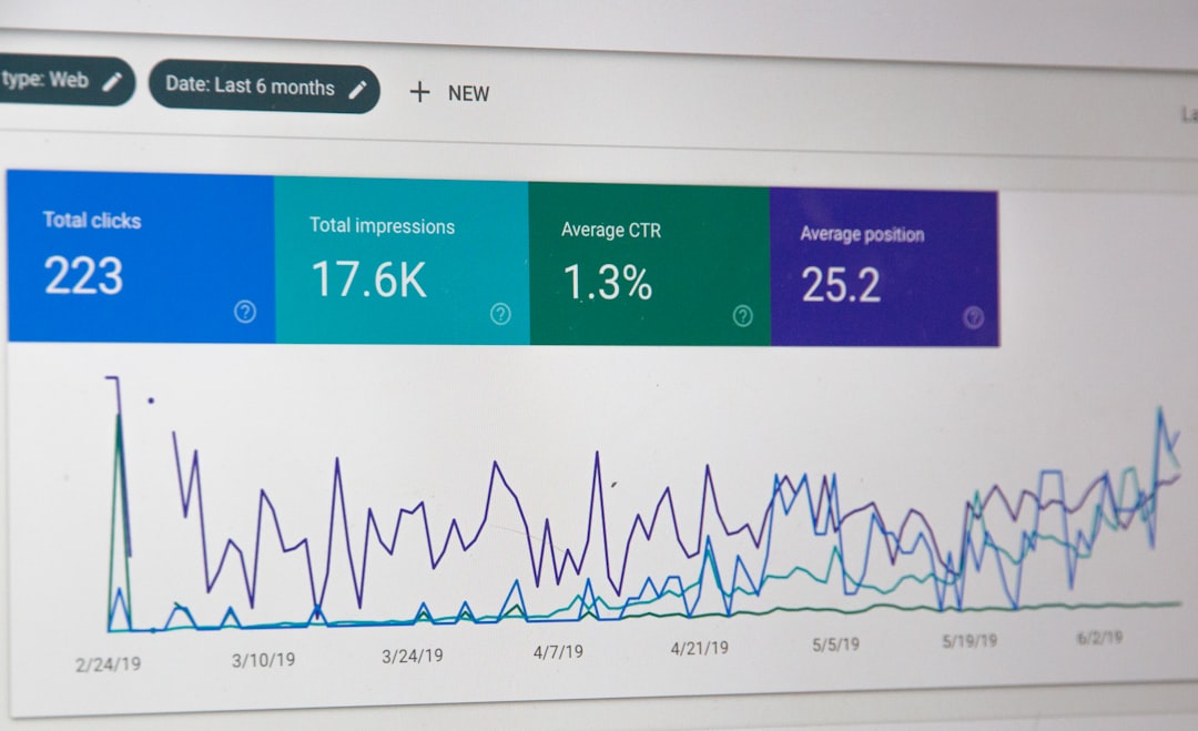
Best Practices for SEO Dashboards
- Keep it focused: Avoid adding every available metric. Include what supports decisions.
- Use consistent naming: Label charts clearly so non-SEO users understand them.
- Design for readability: Use spacing, headings, and visual hierarchy.
- Check data accuracy: Make sure filters, sources, and date ranges are correct.
- Include business outcomes: Connect SEO performance to conversions, leads, or revenue where possible.
- Review regularly: Update the dashboard as goals, strategy, and reporting needs change.
Final Thoughts
Google Data Studio is a powerful tool for SEO reporting because it transforms complex search data into dashboards that are visual, interactive, and easy to share. When built thoughtfully, a dashboard can show more than rankings and traffic; it can reveal opportunities, explain performance changes, and guide the next strategic move.
The key is to build with purpose. Choose metrics that matter, organize the report clearly, and add insights that help people understand the story behind the numbers. With the right setup, your SEO dashboard becomes more than a report. It becomes a decision-making tool that keeps your search strategy focused, measurable, and continuously improving.