Use Canva to design the mailer, but use Mailchimp to send, track, and improve it. Canva is better for polished visuals, quick layouts, brand graphics, and print-ready pieces. Mailchimp is better for email delivery, contact lists, automations, A/B tests, signup forms, and reporting. If your mailer must actually reach inboxes and produce measurable sales, Mailchimp should handle the final campaign.
TLDR: Canva is the better creative tool, while Mailchimp is the better marketing tool. For example, a local fitness studio could design a bold “New Year Offer” graphic in Canva, then send it through Mailchimp to 2,000 subscribers and track a 34% open rate, 6% click rate, and 18 trial bookings. If you only need a flyer or PDF, Canva may be enough. If you need email performance data, list management, and follow-up messages, Mailchimp is the safer choice.
Canva vs Mailchimp: The Simple Difference
A marketing mailer can mean a few things. It may be an email newsletter, a promotional postcard, a PDF flyer, or a direct mail piece. That is why Canva and Mailchimp often get compared, even though they solve different parts of the job.
Canva is a design platform. It helps you make the mailer look good. You pick a template, add colors, drop in product photos, write short copy, and export the result.
Mailchimp is an email marketing platform. It helps you send the mailer to real people, segment your audience, avoid messy list problems, and check what happened after the send.
So the better question is not “Which tool is better?” It is “What kind of mailer are you creating?”
When Canva Is the Better Choice
Canva shines when visual impact matters most. If you need a mailer that looks polished without hiring a designer, it is hard to beat. The templates are easy to edit. The brand kit keeps fonts and colors tidy. The drag and drop editor feels friendly, even for non-designers.
Use Canva when you are creating:
- Printed postcards for events, coupons, or grand openings
- PDF mailers for sales sheets, menus, catalogs, or announcements
- Social posts that match your email campaign
- Header graphics for newsletters
- Product visuals for promotions and seasonal offers
Canva also works well for teams. A marketing manager can make the first version, then share it with a business owner for comments. No one has to email filenames like final final version 7 updated really final.pdf. That alone saves a small slice of sanity.
The catch is that Canva is not built for serious email sending. You can design newsletter-style layouts, but exporting them into a clean, responsive email is not always smooth. Expect to waste time on spacing issues if you try to turn a full Canva design into an actual email blast. A beautiful image-heavy design may also load slowly or get clipped in inboxes.
When Mailchimp Is the Better Choice
Mailchimp is the better option when the mailer needs to be sent to a list and measured afterward. It gives you the tools that matter after the design is done.
Use Mailchimp when you need:
- Email campaigns sent to subscribers or customers
- Audience segmentation by interest, location, purchase history, or behavior
- Automation such as welcome emails, abandoned cart reminders, or birthday offers
- A/B testing for subject lines, content, or send times
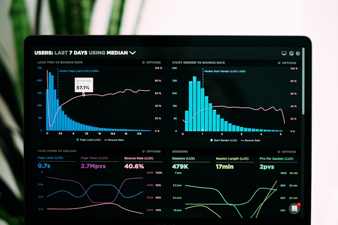
- Analytics such as opens, clicks, bounces, unsubscribes, and revenue
Mailchimp’s editor is solid, though not as fun as Canva. It drives me a little crazy that small design tweaks can take more clicks than they should. Moving a block, adjusting padding, or lining up a section can feel slower than making the same change in Canva. Still, Mailchimp wins where it counts: delivery, compliance, data, and follow-up.
For example, a boutique may send a spring sale mailer to 4,500 contacts. Mailchimp can show that the campaign received 1,530 opens, 270 clicks, 42 purchases, and $3,860 in attributed revenue. Canva cannot tell you that. It can make the sale banner look great, but it will not tell you which customers clicked the “Shop Dresses” button.
Mailer Creation Workflow: Best of Both Tools
The smartest workflow is often to use both. Start in Canva. Finish in Mailchimp.
- Plan the goal. Decide if the mailer should drive bookings, sales, event signups, downloads, or replies.
- Write the offer first. Keep it clear. One mailer should usually have one main action.
- Create graphics in Canva. Design a hero image, product collage, coupon graphic, or branded header.
- Export images correctly. Use PNG for sharp graphics and JPG for photos. Keep file sizes reasonable.
- Build the email in Mailchimp. Add text as live text, not as one huge image.
- Add buttons and tracking links. Make the call to action impossible to miss.
- Send a test email. Check it on desktop and phone.
- Review the report. Use open rates, clicks, and sales to improve the next mailer.

Do Not Make the Whole Email One Big Image
This is one of the most common mailer mistakes. Canva makes it tempting to design the entire email as one image. It looks perfect in the editor. Then it hits the inbox and things get annoying.
Some recipients block images by default. Some phones shrink the design until the text becomes tiny. Screen readers may not read the content well. Spam filters may also dislike image-only emails. Your great offer can end up invisible or hard to tap.
A better approach is simple. Use Canva for visual sections. Use Mailchimp for the structure. Put headlines, body copy, buttons, and links directly inside Mailchimp. This keeps the email readable, searchable, trackable, and more accessible.
Design Tips for a Better Marketing Mailer
A good mailer does not need to be fancy. It needs to be clear. The reader should understand the offer within three seconds.
- Lead with the benefit. “Save 25% on fall jackets” is stronger than “Our seasonal collection has arrived.”
- Use one main call to action. Too many buttons split attention.
- Keep copy short. Aim for brief sections and scannable lines.
- Use contrast. Buttons should stand out from the background.
- Optimize for mobile. Many lists see over 50% of opens on phones.
- Personalize when useful. A first name or product category can lift clicks, but do not overdo it.
Cost and Skill Level
Canva is usually easier for beginners. A staff member can create a decent flyer in 20 minutes using a template. The paid version adds brand kits, premium assets, background removal, and better team features.
Mailchimp has more setup. You need to import contacts, create segments, confirm sender details, understand unsubscribe rules, and test campaigns. That sounds boring because it is. But it also protects your business from messy sending habits that hurt deliverability.
If you send emails often, Mailchimp’s learning curve pays for itself. If you only need an occasional printable coupon or event handout, Canva may be all you need.
Which One Should You Pick?
Pick Canva if your mailer is mostly visual, printable, or meant to be shared as a PDF. It is ideal for restaurants, salons, real estate agents, fitness studios, schools, nonprofits, and event teams that need polished materials fast.
Pick Mailchimp if your mailer is an email campaign. It is better for ecommerce shops, service businesses, membership groups, and any team that wants to track clicks, sales, or signups.
Pick both if you want the strongest setup. Create the eye-catching parts in Canva. Send and measure the campaign in Mailchimp. That pairing gives you better design and better marketing control without forcing one tool to do a job it was not built to do.
The practical rule is this: Canva makes the mailer attractive. Mailchimp makes the mailer perform. If results matter, do not stop at a pretty design. Build the campaign, test it, send it, and use the numbers to make the next mailer sharper.