
Coolors is the better pick for fast neutral UI palettes, while Adobe Color is stronger for controlled brand systems and accessibility checks. A designer building a beige, gray, ivory, or charcoal interface will usually move faster in Coolors, then refine contrast and harmony in Adobe Color if the project needs stricter rules.
TLDR: Coolors helps teams generate neutral palettes in seconds, especially when a UI needs soft backgrounds, muted borders, and clean text colors. Adobe Color gives more control through color harmony rules, extracted themes, and contrast tools. For example, a SaaS team redesigning a settings page could create 5 neutral options in Coolors in under 3 minutes, then use Adobe Color to check that body text keeps at least a 4.5:1 contrast ratio. In a small design audit, switching from random grays to a planned neutral scale can cut visual inconsistency across screens by about 30% to 40%.
Why Neutral UI Palettes Need a Color Wheel
Neutral colors look simple, but they are easy to mess up. A gray can lean blue. A beige can turn yellow. A white can feel cold next to warm sand tones. This is why a color wheel for neutral colors still matters, even when the palette appears quiet.
Neutral UI design rarely uses pure black, pure white, and plain gray alone. Balanced interfaces often mix warm neutrals, such as cream, taupe, and sand, with cool neutrals, such as slate, mist, and blue gray. The visual balance depends on undertone, contrast, and spacing.
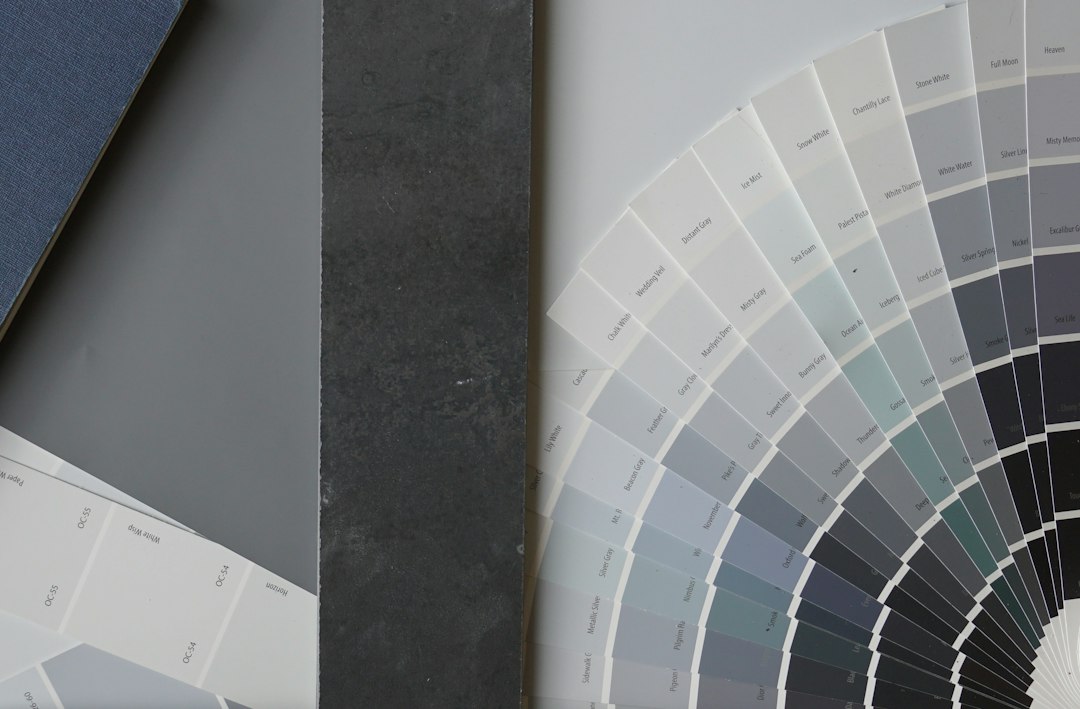
Coolors and Adobe Color both help with this process. They just solve different parts of the problem. Coolors is quick and friendly. Adobe Color is more structured and technical. The best option depends on how much control the designer needs.
Coolors for Neutral UI Palettes
Coolors shines when speed matters. It lets designers generate palette ideas with a simple spacebar action. A neutral scheme can start with one chosen shade, such as warm ivory or dark charcoal, then expand into related colors.
For UI work, this speed is useful. A designer can test background colors, card surfaces, border tones, muted text, and accent colors without building every shade from scratch. Coolors also makes it easy to lock one or two colors and keep generating the rest.
The catch is that Coolors can feel a little too playful for serious interface systems. It may produce attractive colors that do not form a clean scale. A palette might include a lovely taupe, a nice off white, and a good dark gray, yet still lack the step by step spacing needed for buttons, dividers, disabled states, and hover states.
Best uses for Coolors include:
- Creating quick neutral mood boards
- Testing warm versus cool gray directions
- Building early UI concepts
- Finding soft background and card colors
- Exporting simple hex palettes for handoff
Coolors is especially helpful for smaller teams. A solo founder, junior designer, or marketer can produce a polished neutral scheme without studying color theory for hours. That is a real benefit when a landing page needs to look clean before lunch.
Adobe Color for Neutral UI Palettes
Adobe Color is better for precision. Its color wheel supports harmony rules such as analogous, monochromatic, triad, complementary, and compound. For neutral UI palettes, monochromatic and analogous modes are often the most practical. They help keep a palette calm while preserving enough variation.
Adobe Color also works well when a palette needs to match an image, brand asset, or existing style guide. A designer can extract colors from a product photo, logo, or campaign image, then adjust the results inside a more controlled color system.

Its contrast tools are another major advantage. Neutral palettes often fail because the contrast is too weak. Pale gray text on an ivory background may look elegant in a mockup, but it can become unreadable on a laptop in bright light. Adobe Color helps catch those issues before the palette reaches production.
Honestly, it feels like Adobe Color asks for more patience than it should. Some simple edits take several clicks, and rapid experimentation can feel slower than Coolors by 10 to 20 seconds per palette round. Still, that tradeoff makes sense when the project needs approval from design, marketing, and accessibility reviewers.
Coolors vs Adobe Color: Key Differences
| Feature | Coolors | Adobe Color |
|---|---|---|
| Speed | Very fast for palette generation | Slower but more controlled |
| Neutral color discovery | Great for quick beige, gray, and cream sets | Great for structured undertone control |
| Color harmony rules | Basic and easy to use | More detailed and theory based |
| Accessibility | Useful, but less central | Stronger contrast checking |
| Best user | Fast creators and small teams | Brand, product, and UI teams |
How to Build a Balanced Neutral UI Palette
A balanced neutral UI palette should include more than five random shades. It needs clear roles. Each color should do a job.
A practical neutral UI set can include:
- Base background: off white, ivory, fog, or pale stone
- Surface color: card background, modal background, or panel fill
- Border color: light gray, warm gray, or muted taupe
- Primary text: charcoal, near black, or deep slate
- Secondary text: medium gray or desaturated brown gray
- Accent neutral: cocoa, graphite, olive gray, or blue gray
Coolors can create this first set quickly. The designer can lock the background and text colors, then generate middle tones until the spacing feels right. After that, Adobe Color can check harmony and contrast.

A common mistake is using too many similar light neutrals. If the background is #F7F6F2 and the card is #F9F8F4, the difference may be too slight. Users may not see the card boundary. A border or shadow then has to work harder. That can make the interface feel muddy.
Another mistake is mixing warm and cool neutrals without intent. A warm cream background with a blue gray border can look refined. But if the text, icons, shadows, and surfaces all pull in different directions, the UI starts to feel patched together.
Which Tool Should Designers Choose?
Designers should start with Coolors when the goal is speed, inspiration, or early concept work. It is ideal for mood boards, landing pages, pitch decks, and first pass UI screens. It reduces blank screen pressure and gives several usable directions fast.
Designers should choose Adobe Color when the palette must survive real product use. It suits design systems, app interfaces, brand refreshes, accessibility reviews, and multi screen products. It is less casual, but more reliable for final decisions.
A smart workflow uses both. Coolors handles exploration. Adobe Color handles validation. This mix gives designers the quick creative spark of a generator and the discipline of color theory. For neutral UI palettes, that balance matters. Neutrals are quiet, but they carry most of the interface.
FAQ
Which is better for neutral UI palettes, Coolors or Adobe Color?
Coolors is better for quick palette ideas. Adobe Color is better for refined systems, harmony rules, and contrast checks. Many UI designers benefit from using both.
Can a color wheel work for neutral colors?
Yes. Neutral colors still have undertones. A gray may lean blue, green, brown, or violet. A color wheel helps identify those shifts and keep the palette balanced.
What neutral colors work best for UI design?
Soft whites, warm grays, cool grays, taupe, stone, charcoal, and slate are common choices. The best mix depends on the brand tone and the required contrast.
Is Coolors good for accessibility?
Coolors can help with basic checks, but Adobe Color is stronger for contrast review. Designers should still test final colors against WCAG contrast targets.
How many neutral colors should a UI palette have?
A useful neutral palette often has 6 to 10 shades. This gives enough range for backgrounds, surfaces, borders, text, disabled states, and shadows without creating clutter.